CASE STUDY
JustGrow: an AI-empowered parenting companion
One chat for the whole job of early parenting: tracking, stories, albums, and keeping the family in the loop.
The product and my role
JustGrow is a chat-first AI parenting companion built on a stack of agents (Google ADK) behind a Flutter frontend and Python backend. Parents log baby tracking events in plain language, get personalized bedtime stories, share albums with family, and increasingly use chat as the universal entry point for everything. The product reached 200+ signups and ~50 monthly active users without paid marketing.
The constraint that shapes every product decision: parents are usually holding a baby. One free hand at best. Attention measured in seconds.
I joined as the founding product designer. The founder owned product direction and the major strategic calls; I owned execution end-to-end across UX, frontend, and some backend paths (including AI agent prompts). This case study covers one feature I owned during my nine months on the team.
The idea: baton passing
The founder's vision was to create a feature that would make it easier for parents to hand off care responsibilities to each other, and to make the invisible work visible.
What I built
I built it as a relay race: one runner passing the baton to the next. I made it as light as the explicit model allowed and put its entry point, a heart icon, in the top right of the app bar, the most prominent spot in the app. Tap the heart to open the handoff sheet. Pick which children. Pick your partner. Optionally add a note. Tap Hand Over. The receiver gets a notification, opens the app, reviews the recent events, taps Accept or Decline. If accepted, a shift gets created and backdated to the request time.
Interactive — Try the flow
I designed and built the full feature: API routes, Flutter UI, conflict resolution for two simultaneous handoffs, decline-with-notes flow, animated overlay, haptic feedback. The shift model in the backend was the most complex thing in the codebase outside the agent layer.
What happened
It worked, but adoption was low. Discoverability wasn't the issue; the handoff was the most visible thing in the app. The cost was having to remember to do it at all, at the moment of transition. On top of that, both parents had to be engaged simultaneously, and the receiver had two hours to respond before the handoff expired.
Wanting an outcome is not the same as being willing to pay for it. I never weighed what my solution asked of parents against what they would actually spend at the moment it asked. The parent we imagined at the planning table was the person we built for. The parent on two seconds of attention with a screaming baby was the person who had to use it. Same name, different people.
Why we kept the goal
Two App Store reviews specifically praised the handoff feature. A postpartum night nurse wrote that she recommends JustGrow to every family she works with because the handoff is "perfect for overnight care." A parent wrote that the handoff "saved our marriage" by ending daily morning arguments about who did what overnight. Neither is a counterexample. A night nurse never has to remember the handoff, because documenting a shift is already the shape of her work. A household fighting every morning was paying more for the argument than the handoff cost to perform. Both were willing to spend what it asked. Most parents were not, and I had not priced that.
The founder ultimately made the call to deprecate baton passing, but not the goal behind it. My job was the replacement. The cost was concrete: most of the shift model became dead weight, and the code I was throwing away was my own.
The redesign
The temptation was to iterate on the surface. Prefilled slots, better animation, a more discoverable entry point. That approach would have reproduced the same product mistake at a slightly lower cost.
The actual insight: the data about who did what already existed in the app. Every tracking event has a user_id. Every calendar event has an owner. The system did not need an explicit handoff at all. It needed to read the data that was already being written and surface it intelligently.
Parents do things. They do not declare that they are doing things. Any product model that asks them to declare state will lose to one that infers it.
Design graveyard: 8 directions explored and rejected before landing on passive tracking
Most of the work was ruling things out. I ran eight alternative directions to mockup or written-spec stage and rejected each for a specific reason. Every rejection was a product reason, not a resource one.
Several of these options came out of brainstorming with AI. The work is not the brainstorm. It is the rejection with a reason.
Care strip on home screen
A persistent card between app bar and chat. Stole ~80px of screen real estate permanently. The chat is the home screen and we do not eat into it. Idle state ambiguity: what does the strip show when nothing is happening?
Explicit "On Duty" / "Off Duty" model
Same bookkeeping problem as the handoff with fewer taps. Parents do not declare state. The tracking events themselves are the proof of who is doing what.
Bottom navigation tab
JustGrow is single-screen, chat-dominant. Tabs imply equal weight between sections. Chat is the primary interface by a wide margin and a tab bar would change the app's navigation paradigm and add complexity.
Per-person profile view
No existing foundation. Every stat the view would surface is answerable by a chat query, which is more flexible and has less UI to maintain. Building a screen on speculation does not pass the bar.
Dedicated Activity screen with three tabs
Log tab and Tasks tab duplicate Calendar. Only Contributions is genuinely new. A single tab does not justify a screen with two redundant ones.
Inline summary card in Calendar
Calendar is already dense. Same idle-state problem as the care strip. What does the card show on a day with no data? An empty bar feels broken.
Task assignment model
"Assigned to Dad, due tomorrow, status: pending" is Jira for families. Wrong emotional register. Creates a manager-worker dynamic between co-parents.
App bar pill (revived, killed again)
Risks repeating the original problem. Existing timer pills work because they are time-sensitive and disappear when the session ends. A persistent contribution pill has no urgency signal and would blend into the furniture.
The constraint that came out of the exploration was "zero new screens, zero new agents." It is not minimalism for its own sake. It is the call that fell out of every alternative being worse than reusing the chat surface JustGrow already uses for everything.
What replaced it
Three pieces, all in chat.
Passive attribution
Existing tracking events already carry user_id. No new logging primitives for the user. If they would not have logged it before, they do not log it now.
Past-tense logging via existing agents
"I went to get groceries at 2pm" said at 4pm used to fall to casual chat because it matched no tracking keyword and no calendar keyword. Two prompt expansions to existing agents close the gap; the backend already accepts past timestamps. Past-tense chore events are stored as calendar events with a source tag so the frontend filters them out of the calendar view; they exist only for contribution counting.
Weekly digest in chat
A Sunday cron generates a digest message and injects it into each user's chat stream as an assistant message. Two layers: a shared family-wide total with no names ("70 things handled this week") and a private mirror only the individual sees ("you logged 41 of 70"). The app provides both numbers. It never does the subtraction.
The "no subtraction" rule is the product boundary. JustGrow helps families see the work. It does not referee the argument. The product is built for collaborative families that lack visibility, not for adversarial ones. Designing for the adversarial case would make the product worse for the healthy majority.
From asking too much to asking nothing
The restraint behind the "no subtraction" rule also shapes how the feature shows up in someone's day. Participation is optional. There is no button on the home screen waiting to be tapped, no streak to keep alive, no pressure to log everything. The feature surfaces when you reach for it and stays quiet otherwise. And because contribution counts include any household work, not just baby care, the feature has reason to live well beyond the infant stage.
The new design does not close off the use cases from those two reviews. Passive attribution still records every event with a user_id, so the data both reviewers valued is still captured automatically. They reach it through chat instead of a handoff form. The parent who was fighting about who fed the baby at 2am can ask "what happened overnight?" and get a summary. The night nurse can ask the agent to recap her shift and the parents see it when they wake up. One extra sentence to type instead of a four-tap handoff, and the majority of parents who never wanted baton passing no longer pay for it.
In two moments
Sunday evening, the agent posts a recap card. Two stacked bubbles: a shared family-wide total with no per-person names, then a private "Only you" mirror with the individual's count and category breakdown. Hierarchy is deliberate. The headline number carries weight; the category breakdown is supporting; the closing line reframes effort as recognition rather than scorekeeping.
Weekly digest as agent-posted recap
When a parent opens the app after several hours away, the agent posts a "since you were last here" card. The same chat surface handles task creation through conversation and contribution queries on demand. Every piece of contribution data a per-person profile screen would show is answerable conversationally, with a proportion bar where comparison is requested but never volunteered.
Catch-up card and task creation through conversation
Chat-native contribution and planning queries
These mockups are not Figma comps. The shipping app is Flutter and Dart; the mockups are HTML and CSS so the spec, the rationale, and the visual live in one document. Color tokens, typography, and spacing are pulled from the JustGrow codebase, so what renders above matches the production design system.
What else I owned
Nine months of surface area. Contribution tracking was one piece of it.
Design system
Tokens, type, and components. Includes a constraints log so deliberate exceptions don't get "fixed" later.
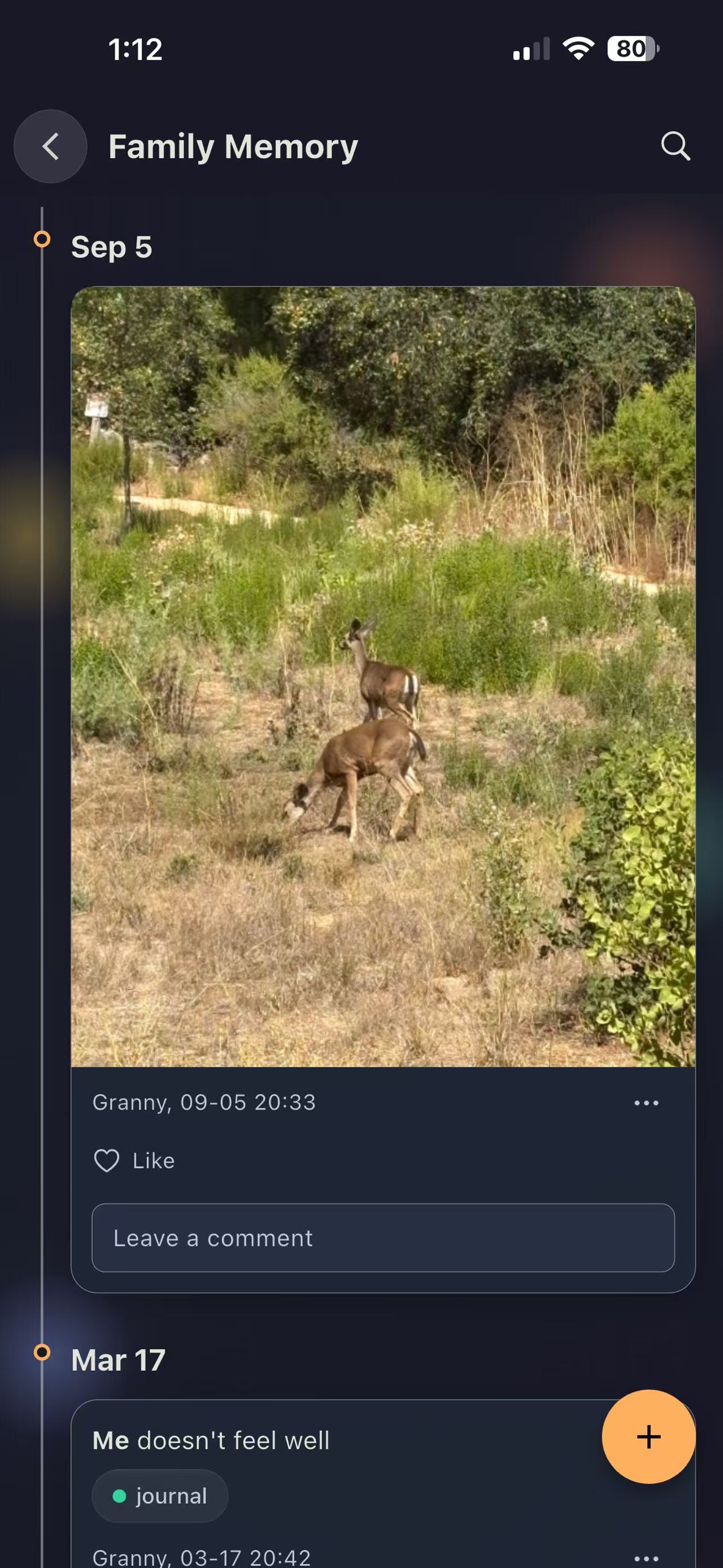
Memory
Family photo memories — shared albums and the upload manager behind them, now unified as one feature.
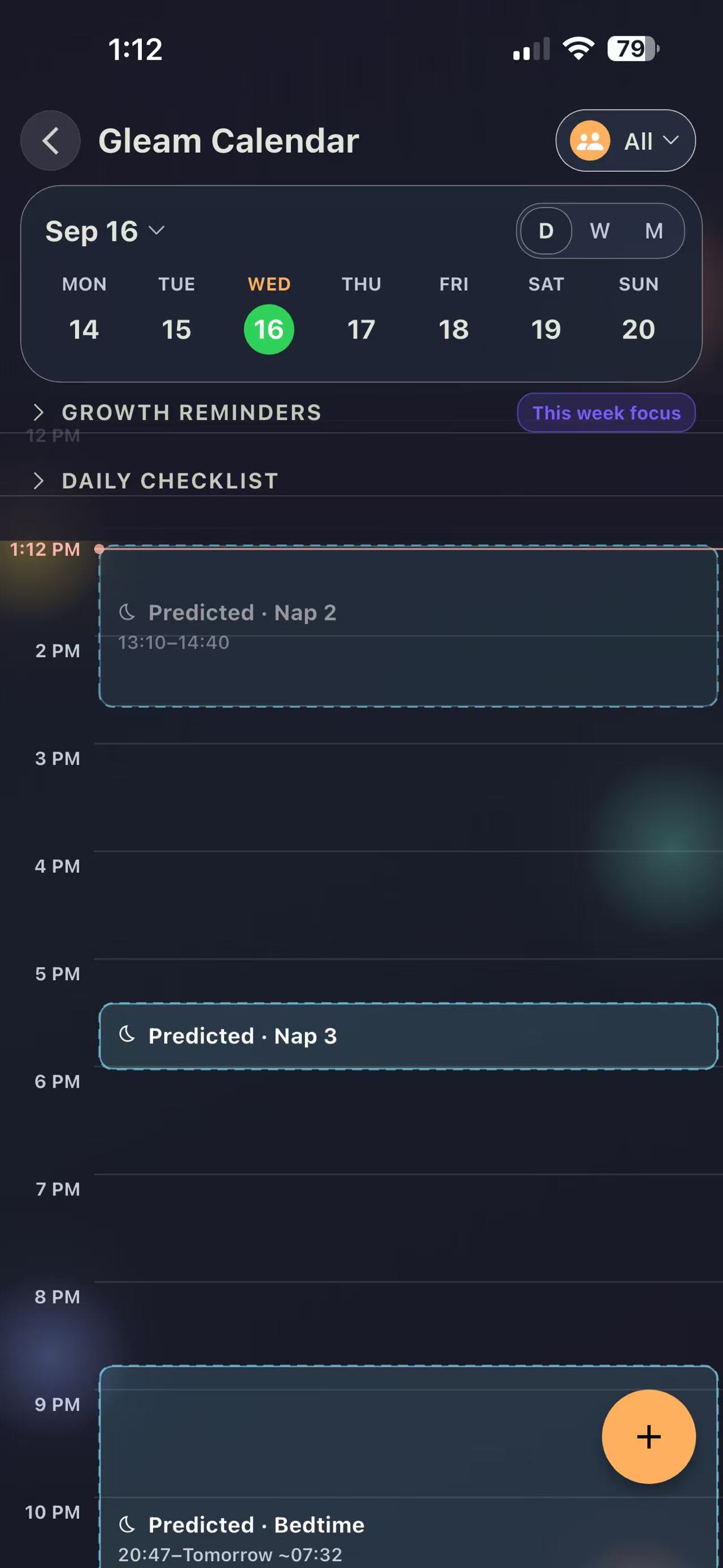
Tracking summary
Logged events turned into a day view: predicted naps, growth reminders, and a daily checklist. Now called Gleam Calendar.
What this work taught me
Price what the path asks before scoping it. Wanting an outcome is not the same as being willing to pay for it. The user a feature is designed for and the user mid-task share a name and are different people, so I weigh what a solution demands against what they will actually spend, before I scope rather than after.